Here’s another quick CSS3/WebKit transitions project in the controversial realm of CSS animation. This time I have opted to recreate the popular parallax effect using multiple background images on a single element and the -webkit-transition property. I have based this on Chris Coyier’s parallax tutorial, reusing the star images with permission, the technique itself was coined by Paul Annett (explanation on Think Vitamin). If you’re not quite sure what parallax is, then Chris and Paul both go into some depth to explain it and Wikipedia is always helpful.
Result
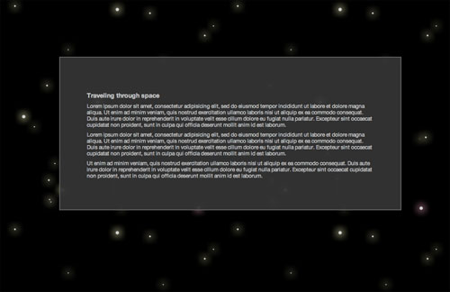
Experiment: Auto-scrolling CSS3 Parallax Effect
Experiment works in Safari 4 Beta and Google Chrome. No JavaScript necessary.
: Experiment updated. Transitions are now widely supported. Support includes Opera, Firefox and IE10.
How To
The HTML markup is fairly simple, one DIV for the background and another for the content, the example uses CSS3’s multiple backgrounds, so no need for extra markup to accommodate all those other images:
<div id="background"></div>
<div id="content">
  Content
</div>
For the CSS the background container is set to a fixed position (for convenience more than anything) and spread across the bottom of the page using the top, left, bottom and right properties. The background images are defined using the background shorthand property with multiple declarations being comma delimited, the first being the top-most. Each of the images has a different position defined in percentage, so as the size of the container changes (eg on window resize) the images move disproportionately to each other; creating the impressive parallax effect.
#background {
  background: url('../images/foreground.png') 5% 5%,
    url('../images/midground.png') 20% 20%,
    url('../images/background.png') 90% 110%;
}
Ordinarily this effect is only seen when the page is re-sized or JavaScript is used for animation. My first approach to animation via CSS was to apply the transition to the background-positions, with background-position being an animatable property as defined in the proposed specification. However this doesn’t yet work in the latest WebKit nightly build (r42142), it is a known bug.
As an alternate route, albeit a temporary one, I have opted to use transitions to animate the left-most edge of the background container (for instance from 0px to -100px). This gradually alters the overall width of the container causing the backgrounds to shift disproportionately as per their percentages, creating the parallax effect. With a large enough duration and left position the effect appears to be continuous.
#background {
  left: 0;
  -webkit-transition: left 300s linear;
}

#experiment:target #background {
  left: -5000px;
}
To make things a bit more fun I’ve increased the ‘flying speed’ when the mouse hovers over the background area. The final CSS looks like this:
#background {
  background: url('../images/foreground.png') 5% 5%,
    url('../images/midground.png') 20% 20%,
    url('../images/background.png') 90% 110%;
  top: 218px;
  left: 0;
  right: 0;
  bottom: 0;
  position: fixed;
  -webkit-transition: left 300s linear;
}

#experiment:target #background {
  left: -5000px;
}

#experiment:hover #background {
  left: -9999px;
}